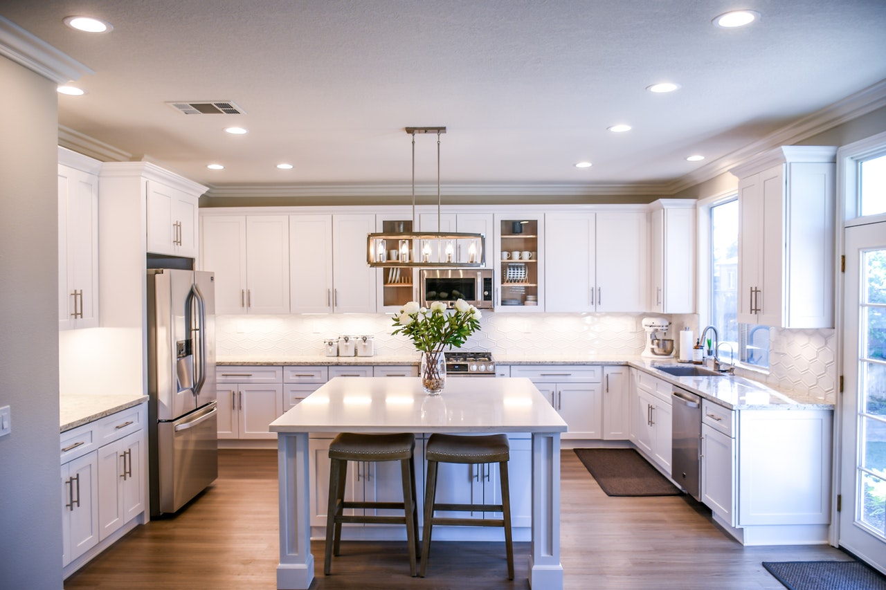
What are the basic principles of interior design?
- Balance
- Rhythm
- Harmony
- Proportion and Scale
- Focus/Emphasis
If you’re buying from a furniture shop in the Philippines, you should consider the basic principles of interior design to create an entirely different look for your room. Any space can become better when you apply these principles. It’s good to keep this in mind, especially if you’re in a rut when it comes to designing your home. Here are the basic principles of interior design you need to remember.
Balance
Balance is an important aspect of any design. Think about the definition of equilibrium. Equilibrium is a state of rest or a balance due to the equal action of opposing forces. When applying this to interior design, it all boils down to creating a balance through the visual weight of the objects. This can also be applied to color, texture, and patterns.
There are three different kinds of balance you should remember. Symmetrical balance, asymmetrical balance, and radial balance.
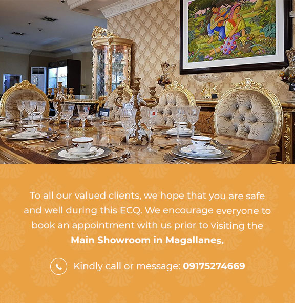
Symmetrical balance calls for the space to be evenly split so that two sides mirror each other. You can find a good example of this on your dining tables. It’s best that each opposite side has an equal amount of chairs in place to create this symmetry. This is the easiest to achieve and often people are more drawn to symmetry as the visual appeal makes it a popular choice. This can become monotonous if used frequently, so it’s not always good to apply depending on your space.
Asymmetrical balance uses the visual weight of lines, colors, and textures without creating an exact duplicate. This type of balance is more visually complex than symmetrical balance and it can quickly add interest and accent to any space.
Radial balance uses a central focal point with other pieces framing around it. Round dining tables are a good example of this as the chairs surround it to accent the table as a focal point. You’ll find that for radial balance, you can use a lot of repetitive colors and textures.
Rhythm
Rhythm in interior design is used to create repetitive patterns and contrast in order to create visual interest. Rhythm can be achieved by repeating the same colors and shapes at various intervals. Examples of good rhythm are by repeating colors and patterns on different furniture. If you’re using ruby-colored pillows, you can repeat the tone by using it for rugs and vases. It’s much more visually interesting compared to colors just splashed within the room without thought. Another example is by utilizing different textures. Metallic texture such as copper can be found in the kitchen and can be repeated on other furniture in another room. This makes your overall design look and feels more cohesive.
Harmony
Harmony is about creating a unified message. If rhythm is used to create visual excitement, harmony is used to generate a space of tranquility. Create harmony by focusing on one thing, may it be color, shape, size, and texture. Harmony encompasses all other elements, cohesively using them so that they can work together and complement each other. You have to start by seeing your space as a whole being. Each element of the space should be able to unify the function of the space. This can also apply to transitions. Harmonious transitions are more visually appealing compared to a staggered pattern.
Proportion and Scale
Proportion depicts the ratio of the size of one part to another. The scale is how the size relates to another object or the space it’s placed in. We can find the utilization of the concept of scale in a lot of places such as restaurants and offices. From the chairs to tables, you’ll notice the concept of scale almost immediately. Sometimes your design goals need to have different proportions and scales to create visual interest. Not everything about proportion and scale has to be by the book as sometimes designs don’t always work in our favor. You need to turn it around somehow by using other techniques.
Focus/Emphasis
This is probably the easiest one to understand out of all the principles. Your central piece should be attention-grabbing since it will be the focal point of your room. It can be a painting or accent furniture, as long as it can draw the eye to that point. You can use elements, like color, texture, lines, and patterns to create emphasis and keep the eyes focused on the piece. Emphasis pulls everything together to create a cohesive interior design.
Key Takeaway
Use these principles when you’re exploring your furniture shop in the Philippines. You can even try applying these to the furniture you already have at home to change the whole look and vibe of the space. These principles give you a good starting point without being too complicated. The principles of interior design can change an ordinary room into a cohesive and balanced room through the use of creative visuals and proportions. Remember these basic principles of interior design next time. It can create a new visual you’ve never seen before without much effort.
